Showing posts with label object typography. Show all posts

Friday, August 17, 2012

String Typography


Did I ever tell you about the time I did string typography?! No, I doubt I did, so let me go ahead now.

Last semester I had just started my "Design Research Assistant" job. My first assignment was to create an identity for a transformative learning conference we were having at school, called Transformative Learning Conference 2012. Clever, I know...

Their whole idea behind the conference is to show connection between students, teachers, learning, participating in on campus activities, etc. I was really excited about this, really excited. It was about the time that 'String Typography' was taking off and I really wanted to do something with it. Plus, it fit within the parameters of showing connection. What better thing to use than to show a network of connections that with string typography!

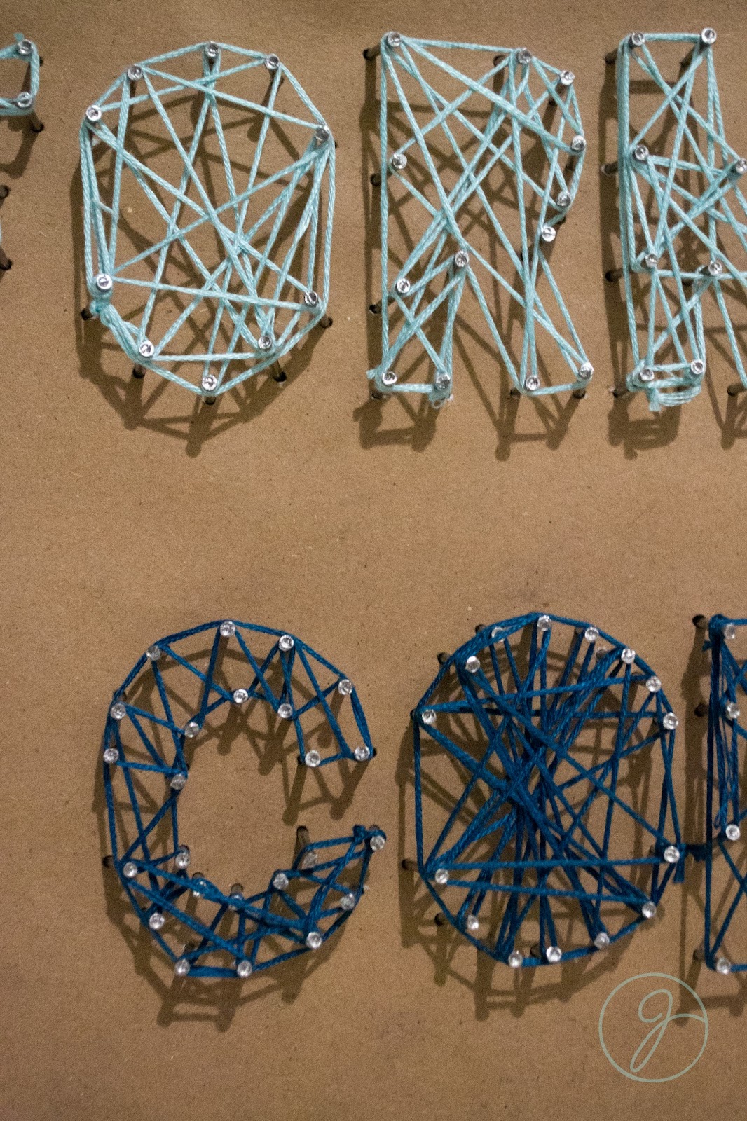
Jump to 5 hours later, 30 dollars in supplies, and some pissed off neighbors I had basically given up. The tutorials I had seen said to "hammer the shape of the letter into plywood". Well at 1 A.M. in an apartment complex with thin walls this is a horrible idea. I plan B'ed it and used some extra foam board I had on hand. It worked a lot better with putting the nails in, but if you look in the photo below the letters got all cattywumpus and sad.


Needless to say, I got pretty far before taking a break for the night. I showed my professor the next day, and while we both liked the idea it's not super legible.  I still want to do something with string typography, but obviously this isn't it.


Design Fail. Lesson Learned.

Thursday, November 17, 2011

Elevate Your Typeface


So for my Graphic Design 2 class we had to come up with a 3D typeface from real world materials. There could be no computer manipulation and it had to be done by hand. 

Now I don't know about anyone else, but every time I told someone I had a class for typography they assumed I was going to make some awesome elevation maps... Not soooo much. So that was the basis of my concept. 

I also had done some other trials for typefaces, but I think the topographic map idea is the strongest and most appealing. 


The materials I used for my lettering

The levels of the letters

Finished products

Better angle of the levels

So after I spent the 30 hours it took to cut out all of the letters (literally) I photographed them and then cut them out in photoshop.


I ended up converting them to grayscale so that there wouldn't be a variation in the color and it would be easier to change the color of them.


The way I photographed them added another level and another shadow, so for my finished typeface I didn't include the extra shadow on the bottom. I thought it would be kind of funny to include them in a few of my other letters and call it Elevate Bold. This may actually end up becoming an additional typeface that I can include if I have the time, but it will look like it's popping off whatever it's placed on in addition to the levels coming up off each other...


What kind of things could you guys see yourself using a handmade 3D typeface for?!