Showing posts with label graphic design. Show all posts

Saturday, August 25, 2012

Personality Types


I was reading Swash + A Sprinkle and they had this awesome link up to Pentagram's What type are you? I realize that they posted the link almost 2 years ago, but the fonts are timeless and beautiful.

When you visit the site you go through and answer a few questions and they will use your answers to determine your personality "type". It seems, for me personally, to be pretty accurate... My personality "type" is Archer Hairline. Emotional, Understated, Progressive, and Disciplined.

I'm particularly fond of the thin forms, and more importantly the mix of serifs and "dots" on the type.


Although I didn't get it, Baskerville (and the italic, as shown) will always be one of my favorite fonts. It's classic, and beautiful!

Friday, August 17, 2012

String Typography


Did I ever tell you about the time I did string typography?! No, I doubt I did, so let me go ahead now.

Last semester I had just started my "Design Research Assistant" job. My first assignment was to create an identity for a transformative learning conference we were having at school, called Transformative Learning Conference 2012. Clever, I know...

Their whole idea behind the conference is to show connection between students, teachers, learning, participating in on campus activities, etc. I was really excited about this, really excited. It was about the time that 'String Typography' was taking off and I really wanted to do something with it. Plus, it fit within the parameters of showing connection. What better thing to use than to show a network of connections that with string typography!

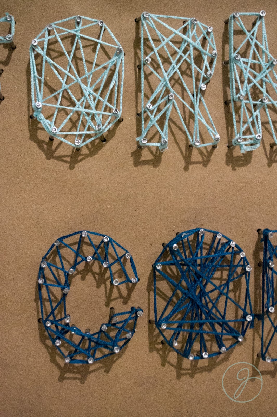
Jump to 5 hours later, 30 dollars in supplies, and some pissed off neighbors I had basically given up. The tutorials I had seen said to "hammer the shape of the letter into plywood". Well at 1 A.M. in an apartment complex with thin walls this is a horrible idea. I plan B'ed it and used some extra foam board I had on hand. It worked a lot better with putting the nails in, but if you look in the photo below the letters got all cattywumpus and sad.


Needless to say, I got pretty far before taking a break for the night. I showed my professor the next day, and while we both liked the idea it's not super legible.  I still want to do something with string typography, but obviously this isn't it.


Design Fail. Lesson Learned.

Tuesday, February 14, 2012

Do Not Enter the Uncanny Valley

Today I read an article about the Uncanny Valley. It was actually really interesting.

"The uncanny valley describes a point at which a human-like animation or robot looks too close to a human and generates a feeling of revulsion or distaste. "


Basically it's the point of being so generated to look like a human that it loses all it's human qualities. It's creepy.


So I was recently asked, or told rather, that I should apply for a student research grant with the design program. Then I decided I may as well be the only one who doesn't know anything about research grants. I know that people write a paper, then they get them, and they they (I'm only assuming at this point) do research. 

Fact: when you type into Google: "What is a Student Research Grant" you get this: 


THESE ARE NOT HELPFUL!
They just made me feel more idiotic about not knowing what it is or what type of projects I can do with them. Great, I'll write a BRILLIANT proposal, but if I can't figure out what things I can propose it doesn't help. Jerks.


So, basically somehow the article popped into my head 8 hours after reading it, but I still have no clue if it's a good topic for a research grant. I e-mailed said teacher asking if it was okay, and if it is I have 2 days to write my paper and turn it in. Easy. Luckily I'm a writing master. I can't talk to save my life, but give me a pen and paper (or less stressful to my hands a computer) and I can write forever. 


Long story short: I may be doing a research project over the effect computers have in taking away the human aspect of design. Or I may not. We shall see. 


Also, I super suggest reading the article, it's interesting! 

Monday, February 13, 2012

My First Magazine

I've been working on making a spread for a magazine for a little more than a month now. We had to choose a magazine (within our group) and make a style guide for it. Then we got to create two magazine spreads based off our guide!
Needless to say, I hated our magazine so I was not excited about the second part. The content of the magazine itself is awesome, but the design of it is sadly lacking.

The best part is the inconsistency of the spreads. 

Anyway- we had to make a main edit well and an ad and edit. I think my spreads turned out pretty well! We could chose our own topic, so I chose building a treehouse for my Main Edit, and natural cleaning products for my A&E. I still have some tweaking to do, but when do I not!


Thursday, January 5, 2012

Come One, Come All

For some reason lately I've been slightly obsessed with circus inspired design. Actually, I'm pretty sure it started with a company called Meri Meri and their charming circus-themed party decor. So damn cute.

With a quick google search I found a ton of amazing invitations from Oh So Beautiful Paper, which is an amazing site! The colors are what I think hooks me. I'm all for browns, creams, and naturals in general, but I've always wanted a little more color. It could be a dash of apple green, teal, bright yellow, etc. As long as there is color I'm happy. But considering that these designs seem to combine muted colors and vibrance somehow I think I'll stay in love for a while.


If I ever have kids I may consider this for them... If I haven't used it for an office by then....


What are your favorite inspirations lately?

Wednesday, January 4, 2012

Kate Spade


For my advertising class last semester I did a brand profile over Kate Spade. I originally started out the project liking her. I now LOVE her brand. I know I've talked about loving her before (as seen here), but it is a fact.

This project below was the book I made for the project. It's probably one of my favorite things I've ever worked on/produced. I ended up using a lot of photography to show her style, advertising, and campaigns. 

Given that I only used the computer I think it turned out really, super well! Especially since the computer hasn't seemed to be as successful as I wanted it to be in the past on basically anything. Somehow I seem to do better with photography and illustration than just making things on the computer.

Tuesday, November 29, 2011

The Kashi Project

So in my advertising class I've been doing a lot of awesome projects. I had my Kate Spade book that I turned in (and made a 100 on) :] and I've had a group project for Kashi. We're supposed to do a complete analysis on the SWOT, Marketing, Target Audience, blah blah blah. That part is boring. The awesome part is that we were supposed to come up with an advertisement for them. So this guy in my group had all the copy done, and I came up with the print ad. I based it off something they would actually use, and I think it turned out pretty well! It still needs a little tweeking, but without further ado: My print ad for Kashi!


I can't make it any larger because it will jack up the layout of my blog, but you can see it larger here!

Monday, November 28, 2011

Oh, Vera....


One of my favorite things about my new job is that we do invitations. I feel slightly guilty because it's not being designed from the ground up, like graphic design has taught me how to do so far, but nonetheless, they are designed... 

Going through the books for wedding invitations I have fallen in love with Vera Wang. The colors she uses, her clip arts, everything. This woman has options to letterpress, use thermography (basically embossing I guess), and engrave. I didn't even know you could engrave paper!


If you have any paper or invitation needs come see me at work!
It would make my heart happy!

Thursday, November 17, 2011

Elevate Your Typeface


So for my Graphic Design 2 class we had to come up with a 3D typeface from real world materials. There could be no computer manipulation and it had to be done by hand. 

Now I don't know about anyone else, but every time I told someone I had a class for typography they assumed I was going to make some awesome elevation maps... Not soooo much. So that was the basis of my concept. 

I also had done some other trials for typefaces, but I think the topographic map idea is the strongest and most appealing. 


The materials I used for my lettering

The levels of the letters

Finished products

Better angle of the levels

So after I spent the 30 hours it took to cut out all of the letters (literally) I photographed them and then cut them out in photoshop.


I ended up converting them to grayscale so that there wouldn't be a variation in the color and it would be easier to change the color of them.


The way I photographed them added another level and another shadow, so for my finished typeface I didn't include the extra shadow on the bottom. I thought it would be kind of funny to include them in a few of my other letters and call it Elevate Bold. This may actually end up becoming an additional typeface that I can include if I have the time, but it will look like it's popping off whatever it's placed on in addition to the levels coming up off each other...


What kind of things could you guys see yourself using a handmade 3D typeface for?!

Friday, November 4, 2011

Pilllow Shmeeellow Final

For anyone who saw my previous pillow post and was wondering what came of the "pillow to be" I finally have your answer. I actually did really good on it! Which I was not only excited about because I was actually really pretty proud of it, but because I've only recently begun getting A's on my design projects. 

As a reminder, this was about the stage I was at when I posted last time... I knew I wanted to do a print on the back, reminiscent of shields, and burlap on the front with a sewed on shield. 

Pillow Exterior
Invite on the inside
I would like to say that my invite on the inside/typography greatly improved! I ended up doing a custom font on the top 2 lines (one...homeless). The logo still needed work, but for the time I had it wasn't the worst thing I could come up with! 

I'm still really pleased with how well the pillow turned out. It looks almost exactly like how I had planned for it to in my sketches. 


I used a screen print process for the back, which adds a unique element, since not all the shields will have turned out the same. I also love how the shield on the front turned out! I ended up hand sewing it, which gave it more character. Over all I think it went pretty well! 


For a few more photos feel free to look at my flickr!